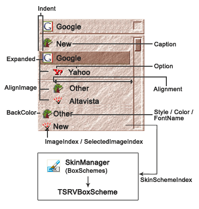
TSRVCBoxItem is a type of item for collection of items of TSRVComboBox.
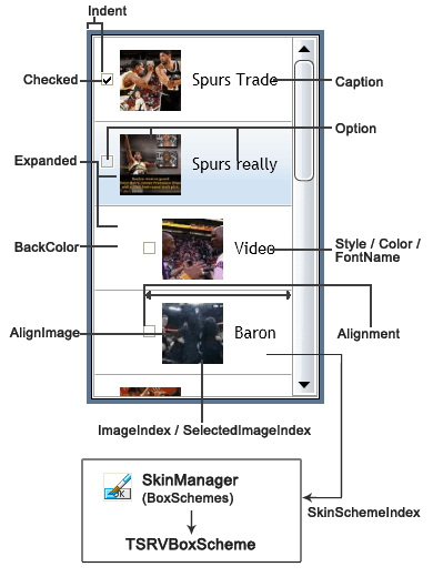
TSRVLBoxItem is a type of item for collection of items of TSRVListBox.
Unit SRVTypeItems;
Syntax
TSRVCBoxItem = class(TCollectionItem);
TSRVLBoxItem = class(TSRVCBoxItem);
Hierarchy
TObject
TPersistent
TCollectionItem
Properties of TSRVCBoxItem
Published properties
Property |
Type |
Default value |
Meaning |
|---|---|---|---|
|
TLRAlignment |
tlraLeftJustify |
Specifies the position of image relative to Caption. RTL BiDiMode inverts value of this property. |
|
TAlignment |
taLeftJustify |
Specifies the horizontal alignment of content inside the item. RTL BiDiMode inverts value of this property. |
|
TColor |
clWindow |
Background color. |
|
TRVUnicodeString |
|
Specifies the text value of the item. Can be hidden, see Options. |
|
TColor |
clWindowText |
Text color for Caption. |
|
Boolean |
True |
Controls whether the item can be selected. |
|
Boolean |
True |
Specifies whether the item is expanded (children are visible) |
|
TFontName |
'Tahoma' |
Font name for displaying Caption. Used only if UseItemFontNames=True for the parent control. |
|
String |
|
Reserved |
|
Integer |
-1 |
Identifies the image associated with this item. ImageIndex is an index into the ImageList property of the parent control. When the item is selected, the item displays the image specified by the SelectedImageIndex property instead, if that property is assigned. Can be hidden, see Options. |
|
TRVPixel96Length |
0 |
Defines both the indent from the left side to the item content, and the level of the item in the items hierarchy. Items with greater Indent are children of the preceding item with smaller Indent. |
|
TSRVItemOptions |
[srvioShowCheckBox, srvioShowImage, srvioShowText, srvioCanSelect, srvioCanHaveChildren] |
Item options (see below) |
|
Integer |
-1 |
Index in the SkinManager.CurrentSkin.BoxSchemes (SkinManager is a property of the parent control). Defines a visual appearance of the item. If equals to -1, ItemSkinSchemeIndex property of the parent control is used. |
|
Integer |
-1 |
Identifies the image associated with this item when it is selected. SelectedImageIndex is an index into the ImageList property of the parent control. If it equals to -1, ImageIndex property is used instead. Can be hidden, see Options. Can be also used for highlighted (under the mouse pointer) items, if see UseSelectedImagesInHotState of TSRVListBox and TSRVComboBox. |
|
TFontStyles |
[] |
Font styles to display Caption. |
|
Integer |
0 |
Stores an integer value as part of the item. |
type
TLRAlignment = (tlraLeftJustify, tlraRightJustify);
TSRVItemOption = (srvioShowCheckBox, srvioShowImage, srvioShowText,
srvioCanSelect, srvioCanHaveChildren);
TSRVItemOptions = set of TSRVItemOption;
Options can include the following values:
•srvioShowCheckBox: if excluded, a check box for this item is not shown (check boxes are shown only if ShowCheckBoxes property of the parent control is True); this option is ignored for combo boxes, it is used only in list boxes;
•srvioShowImage: shows the image specified in ImageIndex and SelectedImageIndex;
•srvioShowText: shows Caption;
•srvioCanSelect: allows this item to be selected; similar to Enabled, but does not provide a visual indication;
•srvioCanHaveChildren: allows this item to have children; if excluded, subsequent items are not treated as its children, even if they have greater Indents;

Properties of TSRVLBoxItem
In addition to the properties inherited from TSRVCBoxItem, TSRVLBoxItem has the following published properties:
Property |
Type |
Default value |
Meaning |
|---|---|---|---|
|
TLRAlignment |
tlraLeftJustify |
Specifies the position of checkbox relative to Caption and image. RTL BiDiMode inverts value of this property. |
|
Boolean |
False |
Specifies whether the check box is checked. See also State property. |
|
TCheckBoxState |
cbUnchecked |
Indicates whether the check box is selected (cbChecked), deselected (cbUnchecked), or grayed (cbGrayed) |
