 TSRVButton
|
<< Click to display table of contents >>
|
TSRVLabel is a control displaying text.
Unit SRVButton;
Syntax
TSRVButton = class(TSRVCustomControl)
TObject
TPersistent
TComponent
TControl
TWinControl
TCustomControl
This component publishes the following properties inherited from TSRVCustomControl:
•DrawOnPrint;
•SkinManager;
•SkinSchemeIndex;
•SRVControlStyle;
•properties inherited from TCustomControl.
New published properties:
Property |
Type |
Default value |
Meaning |
|---|---|---|---|
|
Boolean |
False |
Determines whether the button’s OnClick event handler executes when the Enter key is pressed. |
|
TPicture |
(empty) |
Specified the picture that appears on the button. The picture is displayed to the left/right side of text, depending on BiDiMode. |
|
TModalResult |
mrNone |
Determines whether and how the button closes its (modal) parent form. |
|
TRVPixel96Length |
0 |
Specifies how far Glyph and Caption are shifted when the button is pressed. |
The following published properties work only if SRVControlStyle = srvcsClassic:
Property |
Type |
Default value |
Meaning |
|---|---|---|---|
|
TRVPixel96Length |
2 |
Width of highlight frame under the mouse or when the button is focused |
|
Boolean |
True |
Shows/hides a dotted rectangle drawn on a focused button |
New published event:
•OnClick, occurs when the user clicks the control.
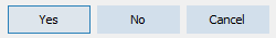
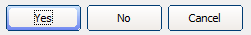
The default button appearance (if skins are not assigned) depends on SRVControlStyle: TSRVControlStyle property:
srvcsSimple (if RVControlsPainter.Theme = rvctPaleBlue):
srvcsClassic:
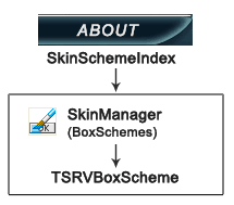
If SkinManager is assigned, the button is drawn using SkinManager.CurrentSkin.BoxSchemes[SkinSchemeIndex].
Example:
You can also use the skin font: SkinManager.CurrentSkin.Fonts[SkinFontIndex].
 Default