 TSRVCheckBox
|
<< Click to display table of contents >>
|
TSRVCheckBox represents a check box that can be on (checked) or off (unchecked)
Unit SRVCheckBox;
Syntax
TSRVCheckBox = class(TSRVCustomControl)
TObject
TPersistent
TComponent
TControl
TWinControl
TCustomControl
This component publishes the following properties inherited from TSRVCustomControl:
•Alignment;
•ButtonSkinSchemeIndex;
•DrawOnPrint;
•SkinManager, SkinSchemeIndex, SkinFontIndex;
•SRVControlStyle;
•properties inherited from TCustomControl.
New published properties:
Property |
Type |
Default value |
Meaning |
|---|---|---|---|
|
Boolean |
False |
Determines whether a check box can be in a “grayed” state. Not supported in a skinned mode. |
|
Boolean |
False |
Specifies whether the check box is checked. If the AllowGrayed property is True, you may find it more useful to use the State property. |
|
TSRVCheckBoxState |
cbUnchecked |
Indicates whether the check box is selected (cbChecked), deselected (cbUnchecked), or grayed (cbGrayed) |
The default check-box appearance (if skins are not assigned) depends on SRVControlStyle: TSRVControlStyle property:
srvcsSimple (if RVControlsPainter.Theme = rvctPaleBlue):

srvcsClassic:

Positions of a box and Caption depend on Alignment:
•taLeftJustify: the box and the caption are aligned to the left; the box is to the left of the caption;
•taRightJustify: the box and the caption are aligned to the right; the box is to the right of the caption;
•taCenter: the box and the caption are in the middle; the box is to the left/right of the caption depending in BiDiMode.
RTL BiDiMode inverts left and right Alignment.
Note: Alignment is different from the standard TCheckBox.Alignment. In TCheckBox, there are only left and right alignments, and they define Caption position relative to a box. In TSRVCheckBox, there are three alignments, and they define alignment of a box and Caption in the control (so the meanings are almost opposite).
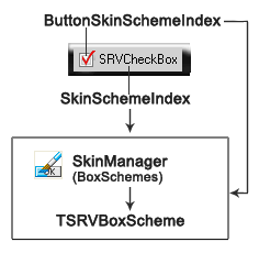
If SkinManager is assigned, the control is drawn using SkinManager.CurrentSkin.BoxSchemes[SkinSchemeIndex], and the box is drawn using SkinManager.CurrentSkin.BoxSchemes[ButtonSkinSchemeIndex]. In this mode, a grayed state is not supported.
Example:
 AllowGrayed